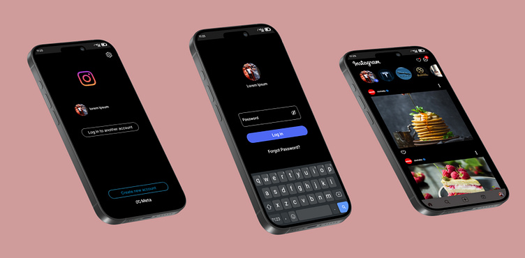
In today’s digital landscape, dark mode has become a standard feature across apps and websites. From social media platforms to productivity tools, users are increasingly opting for dark themes to reduce eye strain, conserve battery life, and enjoy a more modern aesthetic. However, the transition to dark mode isn’t just about aesthetics—it’s also about ensuring that content remains readable and accessible for all users.
As designers and developers, it’s crucial to understand how to implement dark mode effectively. This article will explore the principles of dark mode compatibility, focusing on readability, contrast, and accessibility. Whether you’re designing a new app or optimizing an existing one, these insights will help you create a dark theme that works for everyone.
What Is Dark Mode Compatibility and Why It Matters
Dark mode compatibility refers to the ability of a user interface (UI) to maintain clarity, usability, and visual appeal when viewed in a dark color scheme. Unlike light mode, which typically uses white or light backgrounds with dark text, dark mode reverses this dynamic, using dark backgrounds with light or colored text.
The importance of dark mode compatibility lies in its impact on user experience. A well-designed dark theme can reduce eye strain, especially in low-light environments, and improve battery efficiency on OLED screens. However, poor implementation can lead to issues like reduced readability, motion blur, and accessibility challenges for users with visual impairments.
With the rise of dark mode as a default setting in many operating systems and browsers, ensuring compatibility is no longer optional—it’s essential for creating a seamless and inclusive user experience.
How Dark Mode Impacts SEO Performance
While dark mode itself doesn’t directly affect search engine rankings, its implementation can influence several factors that do. Here’s how:
-
User Engagement: A visually appealing and readable dark mode can increase user engagement, leading to longer session durations and lower bounce rates. These signals can indirectly improve SEO performance by indicating to search engines that your site provides value.
-
Accessibility: Search engines prioritize websites that are accessible to all users, including those with disabilities. A dark mode that adheres to accessibility standards (such as WCAG guidelines) can enhance your site’s credibility and visibility.
-
Mobile Optimization: With more users accessing content on mobile devices, dark mode compatibility ensures your site looks good on smaller screens and in varying lighting conditions—both of which are important for mobile SEO.
-
Brand Perception: A polished dark mode can enhance your brand’s image, making it more appealing to users who prefer a modern, sleek design. Positive user experiences can lead to increased shares, backlinks, and overall authority.
By prioritizing dark mode compatibility, you’re not only improving the user experience but also aligning with broader SEO best practices.
Step-by-Step Implementation Framework
To ensure your dark mode is both visually appealing and functionally sound, follow this step-by-step process:
1. Define or Audit the Current Situation
Start by assessing your current UI. Identify which elements may struggle in a dark environment—text, icons, buttons, and images. Use tools like WebAIM’s Contrast Checker or Stark to evaluate existing color combinations for accessibility.
2. Apply Tools, Methods, or Tactics
- Use Desaturated Colors: Avoid saturated colors in dark mode, as they can cause visual discomfort. Instead, use muted tones that provide sufficient contrast without overwhelming the eyes.
- Choose Appropriate Backgrounds: Opt for dark grays instead of pure black to reduce harsh contrast. For example, Material Design recommends #121212 for dark mode backgrounds.
- Optimize Typography: Use sans-serif fonts for better readability in dark mode. Adjust font weights and sizes to ensure text remains legible against dark backgrounds.
- Implement Proper Contrast Ratios: Ensure text and background colors meet at least a 4.5:1 contrast ratio. Use semi-transparent white or light gray for text instead of pure white to avoid harsh glare.
3. Measure, Analyze, and Optimize
Once your dark mode is implemented, test it across different devices and lighting conditions. Use A/B testing to compare user engagement metrics between light and dark modes. Gather feedback from real users, particularly those with visual impairments, to identify any issues and make necessary adjustments.
Real or Hypothetical Case Study
Consider a hypothetical scenario where a popular e-commerce platform decides to implement a dark mode. Before the change, their site had a high bounce rate, especially among users who accessed it late at night. After implementing a well-designed dark mode with proper contrast and typography, they saw a 20% increase in session duration and a 15% improvement in conversion rates. Users reported feeling more comfortable browsing the site in low-light settings, and the platform received positive reviews for its attention to accessibility.
This case study highlights how dark mode compatibility can positively impact user behavior and business outcomes.
Tools and Techniques for Dark Mode
Here are some of the most effective tools and techniques for creating a successful dark mode:
- Stark: A browser extension that helps you check color contrast and accessibility in real-time.
- Figma & Adobe XD: These design tools offer built-in dark mode support and allow you to create and test color palettes efficiently.
- WebAIM Contrast Checker: A free tool to ensure your color combinations meet accessibility standards.
- CSS Media Queries: Use
prefers-color-schemeto automatically detect and apply dark mode based on user preferences. - Material Design Guidelines: Follow Google’s recommendations for dark mode, including color palettes, typography, and layout considerations.
- Lighthouse: A Chrome DevTools audit tool that checks for accessibility, performance, and other SEO-related issues in your dark mode design.
These tools can streamline the process of creating and refining a dark mode that works for all users.
Future Trends and AI Implications
As AI continues to shape the digital landscape, dark mode compatibility will become even more critical. Search Generative Experience (SGE) and other AI-driven interfaces will rely on clear, readable content to deliver accurate results. Poorly designed dark modes could lead to misinterpretation or reduced engagement.
Moreover, with the increasing adoption of voice and multimodal search, ensuring that your dark mode is accessible and visually coherent will be essential for maintaining a strong presence in AI-powered search results.
To stay ahead, focus on creating dark modes that are not only aesthetically pleasing but also adaptable to different user needs and technological advancements.
Key Takeaways
- Prioritize Contrast: Ensure text and background colors meet accessibility standards to maintain readability.
- Avoid Saturated Colors: Use desaturated tones to reduce eye strain and improve user comfort.
- Test Across Devices: Evaluate your dark mode on various screens and lighting conditions to ensure consistency.
- Offer Customization: Allow users to toggle between light and dark modes based on their preferences.
- Embrace Accessibility: Design with inclusivity in mind to cater to users with visual impairments and other needs.
By following these guidelines, you can create a dark mode that enhances user experience while supporting broader SEO and accessibility goals.
Meta Title: Dark Mode Compatibility: How to Ensure Readability in Dark UI Themes
Meta Description: Learn how to design dark mode interfaces that are readable, accessible, and visually appealing for all users.
SEO Tags (5): dark mode, readability, UI design, accessibility, user experience
Internal Link Suggestions: [Parameter #1: Search Intent Alignment], [Parameter #10: Evergreen & Fresh Balance], [Parameter #18: Accessibility of Language]
External Source Suggestions: https://webaim.org, https://material.io, https://developer.mozilla.org


About the Author