Introduction
In the ever-evolving digital landscape, user engagement remains a cornerstone of successful product design and marketing. As users navigate through websites and apps, their attention is fleeting, making it crucial to implement subtle yet effective UI elements that guide them toward desired actions. Sticky bars, inline CTAs (Call-to-Actions), and floating buttons have emerged as powerful tools in this regard. These elements not only enhance usability but also drive conversions by keeping key actions visible and accessible at all times.
This article explores the practical use cases of sticky bars, inline CTAs, and floating buttons, explaining how they can be strategically implemented to boost user engagement. We’ll delve into real-world examples, best practices, and the impact these elements can have on conversion rates and overall user experience. Whether you’re a product designer, marketer, or developer, understanding the right application of these UI components can significantly improve your digital strategy.
H2: What Are Sticky Bars, Inline CTAs, and Floating Buttons? Why They Matter
Sticky bars are navigation or action elements that remain fixed at the top or bottom of a screen as users scroll. They often contain links, menus, or CTAs, ensuring that users always have access to key functions without having to scroll back up.
Inline CTAs are embedded within the content flow—typically placed in paragraphs, images, or other visual elements. They encourage immediate interaction, such as signing up, downloading, or clicking through, without disrupting the user’s reading experience.
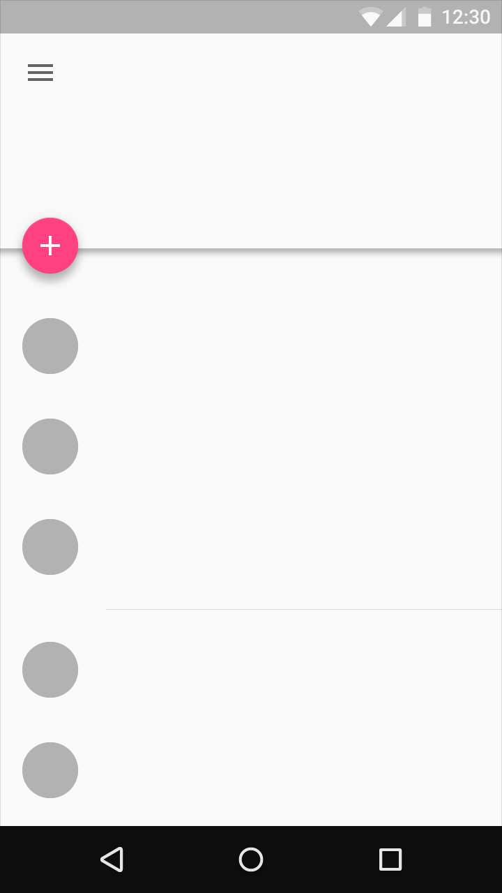
Floating buttons, commonly known as FABs (Floating Action Buttons), are circular icons that float above the interface. They are typically used for primary actions like “Add,” “Create,” or “Share.” Their prominence and motion effects make them highly noticeable and engaging.
These elements matter because they help maintain user focus, reduce friction, and increase the likelihood of conversion. In an era where attention spans are short, these UI components act as gentle nudges that guide users toward meaningful interactions.
H2: How These Elements Impact User Engagement and Conversions
The placement and design of sticky bars, inline CTAs, and floating buttons directly influence user behavior. When implemented correctly, they can:
- Increase Click-Through Rates (CTR): By keeping CTAs visible, users are more likely to engage with them.
- Reduce Bounce Rates: Sticky bars and floating buttons ensure that users don’t miss critical information or actions.
- Improve Conversion Funnel Efficiency: Inline CTAs can seamlessly integrate with content, leading to higher sign-ups or purchases.
For example, a study found that minimizing the number of CTAs on a page and focusing on the most essential ones increased CTR by 43%. This highlights the importance of strategic placement and prioritization.
Moreover, floating buttons are particularly effective in mobile interfaces due to their large, touch-friendly size. They allow users to perform core actions quickly, enhancing the overall user experience.
H2: Step-by-Step Implementation Framework
To effectively utilize sticky bars, inline CTAs, and floating buttons, follow this structured approach:
-
Define or Audit the Current Situation
Begin by analyzing your existing UI/UX. Identify areas where users might be dropping off or missing key actions. Use analytics tools to track user behavior and determine which elements are most effective. -
Apply Tools, Methods, or Tactics
- Sticky Bars: Use CSS or JavaScript frameworks to create responsive sticky bars. Ensure they don’t interfere with the main content.
- Inline CTAs: Place them naturally within content, using bold text, contrasting colors, or hover effects to draw attention.
-
Floating Buttons: Implement FABs using design systems or UI libraries like Material Design. Ensure they align with your brand’s visual identity.
-
Measure, Analyze, and Optimize
Track metrics like CTR, bounce rate, and conversion rate. Conduct A/B testing to compare different designs and placements. Use tools like Google Analytics, Hotjar, or Mixpanel to gather insights and refine your approach.
H2: Real-World Case Study
A food and beverage brand conducted an experiment to optimize its website’s CTA strategy. Initially, the site had multiple CTAs scattered throughout the pages, leading to confusion and lower engagement. After simplifying the layout and placing a single, prominent CTA in a sticky bar at the top of the page, the brand saw a 43% increase in CTR.
Additionally, they introduced a floating button for “Order Now” on mobile devices, which resulted in a 22% increase in orders. The success of this campaign underscores the power of strategic placement and minimalism in UI design.
H2: Tools and Techniques for Implementation
To bring these elements to life, consider using the following tools:
- Figma / Adobe XD: For designing and prototyping sticky bars, CTAs, and FABs.
- Google Analytics: To track user interactions and measure the effectiveness of your UI elements.
- Hotjar: For heatmaps and user recordings to understand how users interact with your site.
- Material Design Components: For consistent and visually appealing floating buttons.
- Unbounce or Leadpages: For creating high-converting landing pages with optimized CTAs.
- CSS Grid / Flexbox: For building responsive sticky bars and layouts.
H2: Future Trends and AI Implications
As AI continues to shape the digital experience, we can expect more intelligent and adaptive UI elements. For instance, AI-powered CTAs could dynamically adjust based on user behavior, while smart sticky bars might predict the next action a user is likely to take.
Voice and multimodal search will also influence how these elements are designed. Expect more seamless integration of CTAs and floating buttons into voice-activated interfaces, making user engagement even more intuitive.
To stay ahead, focus on personalization, responsiveness, and user-centric design. Embrace AI tools that can analyze user behavior and suggest optimal placements for your UI elements.
H2: Key Takeaways
- Strategic Placement Matters: Stick to one or two key CTAs and place them where users are most likely to see them.
- Simplify for Clarity: Avoid cluttering the UI with too many buttons or bars. Focus on what drives the most value.
- Test and Iterate: Use A/B testing to find the best configuration for your audience.
- Leverage AI Insights: Use AI-driven analytics to understand user behavior and refine your UI strategy.
- Prioritize User Experience: Always design with the user in mind, ensuring that these elements enhance, rather than hinder, the overall experience.

Meta Title: Sticky Bars, Inline CTAs & Floating Buttons: Effective Use Cases for User Engagement
Meta Description: Learn how to use sticky bars, inline CTAs, and floating buttons to boost user engagement and conversions. Discover best practices, case studies, and implementation tips.
SEO Tags (5): sticky bars, inline CTAs, floating buttons, user engagement, conversion optimization
Internal Link Suggestions: Parameter #12: Personalized Onboarding, Parameter #15: Gamification in UX, Parameter #8: Product Analytics
External Source Suggestions: https://material.io/components/buttons, https://www.smashingmagazine.com/2020/06/inline-ctas-best-practices/
About the Author