
In a world where data is more abundant than ever, the ability to quickly understand and act on information has become a critical skill. Whether you’re analyzing business performance, conducting scientific research, or making informed decisions in your daily life, visualizing data through tables and charts can make all the difference. This article explores how data tables and charts simplify information comprehension, why they matter, and how to use them effectively.
What Is Data Tables and Charts and Why It Matters
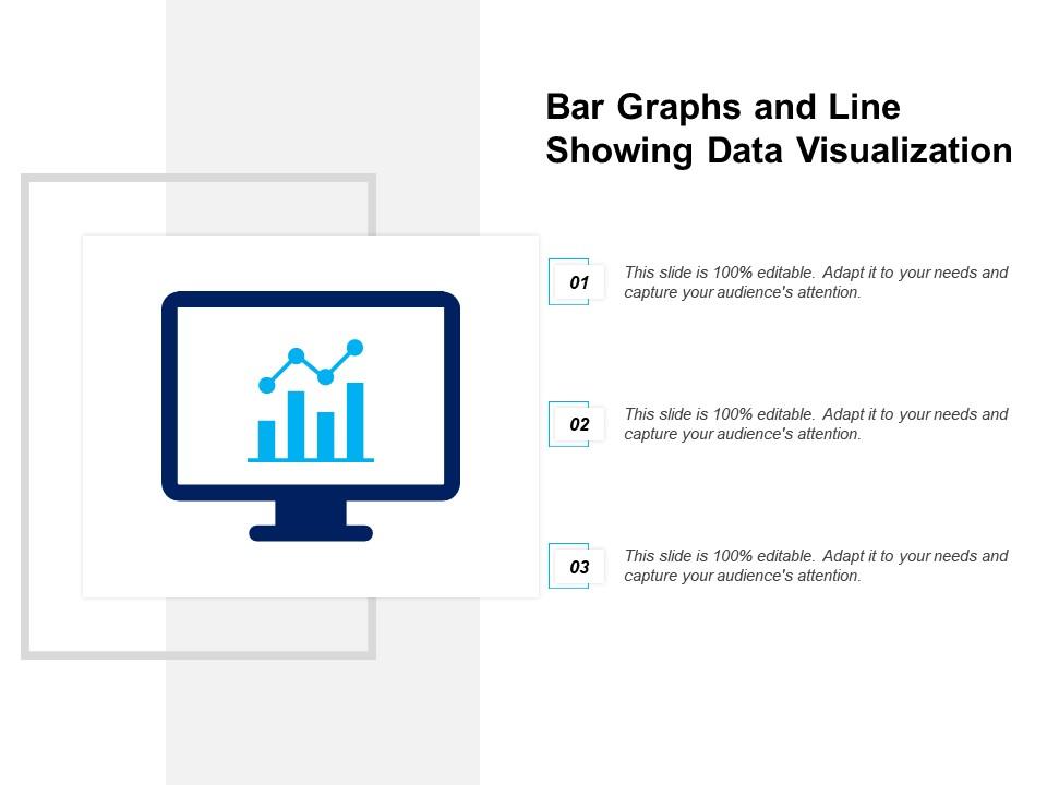
Data tables and charts are tools that transform raw numerical data into visual formats that are easier to interpret. A data table organizes information in rows and columns, while a chart uses graphical elements like bars, lines, and pie slices to represent relationships between data points.
These tools are essential because the human brain processes visual information far faster than text or numbers alone. According to cognitive psychology, people can process visuals 60,000 times faster than text. This makes data visualization a powerful way to communicate complex ideas clearly and efficiently.
For example, consider a sales report with hundreds of numbers. Without proper visualization, it’s easy to miss key trends. But with a simple bar chart showing monthly sales, patterns like seasonal fluctuations or growth spikes become immediately apparent.
How Data Tables and Charts Impact Information Comprehension
Visualizing data doesn’t just make it look better—it makes it understandable. Here’s how data tables and charts influence comprehension:
1. Simplifies Complex Data
When dealing with large datasets, it’s easy to get lost in the details. Tables and charts help identify patterns, trends, and outliers by grouping related data and highlighting important insights.
For instance, a line chart showing the rise and fall of stock prices over time can reveal market trends that would take hours to spot in a spreadsheet.
2. Improves Decision-Making
Visuals enable quicker decision-making by presenting data in a format that’s easy to digest. Business leaders, researchers, and even everyday users can make informed choices based on clear, visual representations of data.
A well-designed dashboard with multiple charts can provide a comprehensive view of key metrics, helping teams track progress and identify areas for improvement.
3. Enhances Communication
Whether you’re presenting to stakeholders, writing a report, or sharing findings with a team, visuals help convey your message more effectively. Charts and tables make it easier to explain complex concepts, ensuring that your audience understands the core message without getting bogged down in details.
4. Supports Memory Retention
Studies show that people remember information better when it’s presented visually. This is especially useful in educational settings, where students often learn more effectively through graphs and diagrams than through text alone.
Step-by-Step Implementation Framework
To effectively use data tables and charts, follow this practical framework:
1. Define or Audit the Current Situation
Start by identifying what data you have and what questions you want to answer. Are you trying to compare performance across regions? Track user behavior? Understand customer satisfaction?
This step helps ensure that your visualizations are aligned with your goals and not just for the sake of aesthetics.
2. Apply Tools, Methods, or Tactics
Choose the right tools for your needs. For basic data analysis, spreadsheet programs like Excel or Google Sheets offer built-in charting capabilities. For more advanced analytics, tools like Tableau, Power BI, or Python libraries such as Matplotlib and Seaborn can be used.
Consider the type of data you’re working with. Bar charts work well for comparisons, line charts for trends, and pie charts for proportions.
3. Measure, Analyze, and Optimize
Once your charts and tables are created, review them for clarity and accuracy. Ask yourself:
– Does the chart tell a clear story?
– Are the labels and titles easy to understand?
– Are there any misleading elements or distortions?
Use feedback from your audience to refine your visuals. A/B testing different chart types can also help determine which format resonates best with your audience.
Real or Hypothetical Case Study
Let’s imagine a scenario where a retail company wants to improve its inventory management. They collect data on product sales, stock levels, and customer preferences across multiple stores.
Initially, the data is stored in a large table with thousands of rows. Without visualization, it’s hard to see which products are selling well and which are not.
By creating a bar chart comparing sales by product category and a line chart showing inventory turnover over time, the company gains valuable insights. They discover that certain items are consistently understocked, leading to lost sales. Based on this, they adjust their inventory strategy, resulting in a 20% increase in sales within three months.
This example shows how data tables and charts can turn raw data into actionable insights, directly impacting business outcomes.
Tools and Techniques for Data Tables and Charts
Here are some of the most effective tools for creating and interpreting data visualizations:
- Excel / Google Sheets: Ideal for basic charts and tables. Offers drag-and-drop functionality and a wide range of chart types.
- Tableau: A powerful data visualization tool that allows for interactive dashboards and real-time data updates.
- Power BI: Microsoft’s business analytics tool that integrates with various data sources and offers advanced reporting features.
- Python (Matplotlib/Seaborn): Great for custom visualizations and statistical analysis.
- R (ggplot2): Popular among data scientists for creating high-quality, publication-ready plots.
- Canva / Piktochart: User-friendly platforms for creating infographics and presentations.
Each of these tools has its strengths, and the best choice depends on your specific needs and technical expertise.
Future Trends and AI Implications
As AI continues to evolve, it’s reshaping the way we interact with data. Tools like AI-powered data visualization platforms are becoming more common, offering automated insights and recommendations based on your dataset.
For example, AI can suggest the best chart type for your data, highlight anomalies, or even generate summaries of complex reports. This reduces the need for manual interpretation and speeds up the decision-making process.
However, it’s important to remember that AI is a tool, not a replacement for human judgment. While AI can enhance data storytelling, it still requires a human touch to ensure accuracy, context, and ethical considerations.
Key Takeaways
- Data tables and charts simplify complex information, making it easier to understand and act upon.
- They improve decision-making by presenting data in a clear and visual format.
- Effective visualization enhances communication and supports memory retention.
- Using the right tools and techniques ensures that your data tells a compelling story.
- AI is transforming the field, but human oversight remains crucial for accuracy and relevance.
In today’s data-driven world, the ability to visualize and interpret information is more important than ever. By leveraging data tables and charts, you can unlock insights, make smarter decisions, and communicate your findings with confidence.
Meta Title: How Data Tables and Charts Help Simplify Information Comprehension
Meta Description: Discover how data tables and charts transform complex data into clear, actionable insights for better decision-making.
SEO Tags: data visualization, information comprehension, charts and tables, data analysis, data storytelling
Internal Link Suggestions: [Search Intent Alignment], [Topical Depth & Relevance], [Original Insights]
External Source Suggestions: https://www.tableau.com/learn/what-is-data-visualization, https://www.datacamp.com/community/tutorials/data-visualization-python