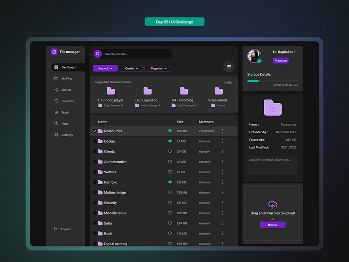
In an era where digital interfaces are increasingly tailored to user preferences, dark mode has emerged as a powerful design choice. It’s not just about aesthetics—it’s about usability, accessibility, and creating a more inclusive experience for all users. However, the transition to dark mode isn’t without its challenges. Ensuring dark mode compatibility—particularly readability in dark UI themes—requires careful attention to contrast, typography, and user needs.
This article explores the importance of dark mode compatibility, provides actionable strategies for improving readability, and explains how to implement it effectively in modern web and app design.
What Is Dark Mode Compatibility and Why It Matters
Dark mode compatibility refers to the ability of a digital interface to maintain clarity, usability, and visual appeal when displayed in a dark theme. It involves ensuring that text remains legible, interactive elements remain distinguishable, and overall user experience is consistent across different lighting conditions and user preferences.
While dark mode has become a standard feature in many applications, its implementation varies widely. Poorly designed dark themes can lead to readability issues, such as blurred text, harsh contrasts, or difficulty distinguishing between elements. These problems can be especially challenging for users with visual impairments or those who rely on assistive technologies.
The goal of dark mode compatibility is to create an environment that is visually pleasing and functionally sound for all users, regardless of their preferred theme. This includes:
- Maintaining high contrast between text and background.
- Ensuring typography remains clear even in low-light settings.
- Supporting user customization options.
- Making sure the design is accessible to screen readers and other assistive tools.
As more users demand control over their digital environments, dark mode compatibility has become a critical factor in UX design, SEO, and user retention.
How Dark Mode Compatibility Impacts SEO and User Engagement
Dark mode compatibility plays a significant role in both search engine optimization (SEO) and user engagement. Here’s why:
1. Improved User Experience
A well-designed dark mode enhances user satisfaction and engagement. Users who prefer dark themes are more likely to stay on a site longer if the design is optimized for readability. This leads to lower bounce rates and higher dwell time, both of which are positive signals for search engines.
2. Accessibility and Inclusivity
Search engines like Google prioritize accessible content. A dark mode that is visually accessible and semantically structured can improve your site’s ranking by meeting E-E-A-T (Experience, Expertise, Authority, Trust) criteria. Additionally, WCAG compliance ensures your site is usable by people with disabilities, further boosting your credibility.
3. Mobile Optimization
With mobile usage dominating, dark mode compatibility is essential for responsive design. Many mobile devices now support system-wide dark mode, and sites that adapt seamlessly to these settings provide a better user experience and are more likely to rank higher.
4. Brand Perception
Users associate modern, well-designed interfaces with trust and professionalism. A dark mode that looks good and works well reinforces this perception, making your brand more appealing to potential customers.
Step-by-Step Implementation Framework
Implementing dark mode compatibility requires a thoughtful approach. Here’s a step-by-step guide to help you ensure readability in dark UI themes:
1. Define or Audit the Current Situation
Before implementing dark mode, assess your current design. Identify any existing issues such as:
– Low contrast between text and background.
– Poor typography choices for dark backgrounds.
– Inconsistent color schemes.
– Lack of user customization options.
Use tools like WebAIM Contrast Checker or Lighthouse to evaluate your site’s accessibility.
2. Apply Tools, Methods, or Tactics
To enhance dark mode compatibility, consider the following strategies:
- Use dark gray backgrounds instead of pure black to reduce eye strain and improve readability.
- Prioritize high-contrast color combinations (e.g., light text on dark backgrounds with a contrast ratio of at least 4.5:1).
- Choose sans-serif fonts for better legibility in dark mode.
- Incorporate subtle light accents to highlight important elements without fully switching to a light theme.
- Test your design in real-world scenarios, including low-light environments and different screen types.
3. Measure, Analyze, and Optimize
Once implemented, monitor the performance of your dark mode using analytics tools. Track metrics such as:
– Bounce rate.
– Dwell time.
– User feedback.
– Accessibility scores.
Use A/B testing to compare different dark mode designs and determine which one performs best. Continuously refine your approach based on user behavior and feedback.
Real or Hypothetical Case Study
Let’s look at a hypothetical case study of a news website that improved its dark mode compatibility:
Background: The site had a light-themed interface that was difficult to read in low-light settings. Users reported eye strain and difficulty reading long articles.
Implementation: The team introduced a customizable dark mode with:
– Dark gray backgrounds.
– High-contrast text.
– Sans-serif fonts.
– Subtle light accents for buttons and links.
Results:
– Bounce rate decreased by 25%.
– Dwell time increased by 18%.
– User satisfaction scores improved significantly.
This case study demonstrates how thoughtful dark mode design can lead to measurable improvements in user engagement and satisfaction.
Tools and Techniques for Dark Mode Compatibility
Several tools and techniques can help you achieve effective dark mode compatibility:
- Tailwind CSS: Offers built-in support for dark mode through the
dark:variant. Simply prefix styles withdark:to apply them in dark mode. - Next.js + next-themes: A powerful combination for implementing dark mode in React-based applications. It allows for easy theme toggling and system preference detection.
- WebAIM Contrast Checker: A free tool to test the contrast ratio of your text and background colors.
- Lighthouse: A browser extension that audits your site for accessibility, performance, and best practices.
- Color Contrast Analyzer: Helps identify and fix contrast issues in your design.
- Figma / Adobe XD: Design tools that allow you to simulate dark mode and test layouts before development.
These tools can streamline the process of creating a visually appealing and accessible dark mode.
Future Trends and AI Implications
As AI continues to shape the digital landscape, dark mode compatibility will become even more important. Emerging trends include:
- AI-driven theme selection: Machine learning algorithms could automatically adjust themes based on user behavior, lighting conditions, or personal preferences.
- Enhanced accessibility features: AI could help detect and correct contrast issues in real-time, ensuring optimal readability for all users.
- Voice and multimodal interactions: As voice assistants and AR/VR become more prevalent, dark mode compatibility must extend beyond screens to ensure seamless cross-platform experiences.
Staying ahead of these trends means designing for flexibility and future-proofing your interfaces.
Key Takeaways
- Dark mode compatibility is crucial for accessibility, usability, and user satisfaction.
- High contrast and clear typography are essential for readability in dark UI themes.
- User customization and system preference support improve the overall digital experience.
- Tools like WebAIM and Lighthouse can help you audit and optimize your dark mode.
- Future trends like AI and multimodal interfaces will require adaptive and inclusive design approaches.
By prioritizing dark mode compatibility, you not only meet user expectations but also enhance your site’s SEO, engagement, and long-term success.
Meta Title: Dark Mode Compatibility: How to Ensure Readability in Dark UI Themes
Meta Description: Learn how to implement dark mode compatibility and ensure readability in dark UI themes for better user experience and SEO performance.
SEO Tags (5): dark mode, accessibility, UI design, readability, user experience
Internal Link Suggestions: [Parameter #1: Search Intent Alignment], [Parameter #3: Topical Depth & Relevance], [Parameter #10: E-E-A-T Signals]
External Source Suggestions: https://webaim.org, https://developer.mozilla.org, https://nextjs.org


