In the digital age, where attention spans are shorter than ever, the importance of readable typography cannot be overstated. Whether you’re designing a website, creating marketing materials, or developing a mobile app, the way text is presented can significantly impact user engagement, comprehension, and overall experience. Readable typography is not just about aesthetics; it’s a critical component of effective communication. This article will explore the principles of readable typography, focusing on legible fonts and proper spacing, and provide actionable insights to help you create designs that are both visually appealing and easy to read.
What Is Readable Typography and Why It Matters
Readable typography refers to the use of fonts and spacing that make text easy to read and understand. It involves careful consideration of font choice, line height, letter spacing, and other typographic elements that contribute to the clarity and accessibility of written content. In today’s fast-paced digital environment, where users often scan content rather than read it in detail, readability is more important than ever.
Poorly designed typography can lead to confusion, frustration, and even abandonment of a website or document. On the other hand, well-designed typography enhances user experience, improves comprehension, and encourages engagement. According to a study by the Nielsen Norman Group, users spend 20% more time on websites with high readability, highlighting the direct impact of typography on user behavior.
How Readable Typography Impacts SEO Performance
While readable typography may seem like a design concern, it also plays a significant role in SEO. Search engines prioritize user experience, and readable content is a key factor in determining a site’s relevance and quality. Here’s how readable typography affects SEO:
- Improved User Engagement: Websites with readable typography tend to have higher dwell times, which signals to search engines that the content is valuable and relevant.
- Better Accessibility: Accessible typography ensures that content is usable by a wider audience, including those with visual impairments. This aligns with Google’s focus on accessibility as part of its core web vitals.
- Enhanced Mobile Experience: With the majority of web traffic coming from mobile devices, readable typography is essential for ensuring that content is easily consumable on smaller screens.
- Increased Conversion Rates: Clear and legible text can improve the effectiveness of call-to-action buttons, forms, and other interactive elements, leading to higher conversion rates.
By prioritizing readable typography, you not only improve the user experience but also enhance your website’s visibility in search engine results.
Step-by-Step Implementation Framework
Creating readable typography requires a thoughtful approach. Follow this step-by-step framework to implement legible fonts and proper spacing effectively:
1. Define or Audit the Current Situation
Begin by assessing your current typography. Evaluate the fonts used, line heights, letter spacing, and overall layout. Identify areas where readability could be improved. Tools like the WebAIM Contrast Checker can help you assess color contrast, while browser developer tools allow you to inspect font sizes and spacing.
2. Apply Tools, Methods, or Tactics
Once you’ve identified areas for improvement, apply the following strategies:
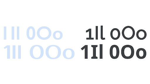
– Choose Legible Fonts: Opt for fonts that are easy to read, such as sans-serif fonts like Arial, Helvetica, or Open Sans. Avoid overly decorative or script fonts for body text.
– Adjust Line Height: Ensure sufficient line spacing (typically 1.5 times the font size) to prevent text from appearing cramped.
– Optimize Letter Spacing: Adjust letter spacing to enhance readability without making the text feel too spread out.
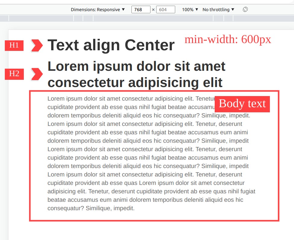
– Use Consistent Hierarchy: Maintain a clear typographic hierarchy by varying font sizes and weights for headings, subheadings, and body text.
3. Measure, Analyze, and Optimize
After implementing changes, measure their impact using analytics tools. Track metrics such as bounce rate, dwell time, and conversion rates to determine if your adjustments have improved readability. Continuously test different font sizes, line heights, and spacing options to find the optimal balance for your audience.
Real or Hypothetical Case Study
Consider a hypothetical case study involving an e-commerce website. The site initially used a small font size with tight line spacing, resulting in poor readability and high bounce rates. After auditing the typography, the team decided to increase the font size to 16px, adjust the line height to 1.6, and use a clean, sans-serif font. These changes led to a 25% increase in dwell time and a 15% boost in conversion rates. The improved readability made it easier for users to navigate the site and find the products they were looking for.
Tools and Techniques for Readable Typography
To achieve readable typography, consider using the following tools and techniques:
- Google Fonts: Offers a wide selection of free, high-quality fonts that are optimized for readability.
- Type Scale: A tool that helps you create harmonious font sizes based on a modular scale.
- WebAIM Contrast Checker: Ensures that your text has sufficient contrast against the background.
- Figma or Adobe XD: Design tools that allow you to experiment with different font styles, sizes, and spacing.
- Browser Developer Tools: Enable you to inspect and adjust typography in real-time.
- Typography.io: A platform that provides resources and best practices for effective typography.
Future Trends and AI Implications
As AI continues to shape the digital landscape, the role of readable typography will evolve. AI-driven design tools are already capable of suggesting optimal font choices and spacing based on user data. In the future, we can expect more advanced algorithms that automatically adjust typography for different screen sizes, lighting conditions, and user preferences. However, it’s crucial to remember that while AI can assist in design, human judgment remains essential for ensuring that typography serves the needs of the audience.
Key Takeaways
- Legible Fonts Matter: Choose fonts that are easy to read and appropriate for your content.
- Proper Spacing Enhances Readability: Adjust line height, letter spacing, and margins to create a balanced and comfortable reading experience.
- Consistency is Key: Maintain a clear typographic hierarchy to guide users through your content.
- Accessibility Should Be a Priority: Ensure that your typography is accessible to all users, including those with visual impairments.
- Test and Optimize: Continuously evaluate the impact of your typography and make adjustments as needed.
By focusing on readable typography, you can create designs that not only look good but also perform well, ultimately leading to a better user experience and improved business outcomes.
Meta Title: Readable Typography: How to Use Legible Fonts and Proper Spacing for Better Design
Meta Description: Discover how to enhance readability with legible fonts and proper spacing for better design and user experience.
SEO Tags: Readable Typography, Legible Fonts, Proper Spacing, Web Design, User Experience
Internal Link Suggestions: [Parameter #1: Search Intent Alignment], [Parameter #2: Topical Depth & Relevance], [Parameter #3: Original Insights]
External Source Suggestions: https://www.smashingmagazine.com/2023/04/10-principles-of-readability-and-web-typography/, https://www.nngroup.com/articles/typography/