In a world increasingly driven by digital content, ensuring that all users—regardless of their visual abilities—can access and engage with information is not just a moral imperative but a practical necessity. One of the most effective strategies for achieving this goal is high contrast design, a technique that significantly improves readability for individuals with low vision. As web developers, designers, and content creators, understanding and implementing high contrast design can make a profound difference in user experience, accessibility, and overall inclusivity.
This article explores the importance of high contrast design, its impact on low-vision users, and how to implement it effectively. Whether you’re optimizing a website, developing an app, or creating digital content, this guide will help you make informed decisions that benefit a broader audience.
What Is High Contrast Design and Why It Matters
High contrast design refers to the use of color combinations that maximize the visibility of text and other visual elements against their background. The key principle here is that the greater the difference between the foreground and background colors, the easier it is for users to distinguish and read the content.
For low-vision users, this is particularly important. Visual impairments such as macular degeneration, glaucoma, or diabetic retinopathy can make it difficult to perceive fine details, especially when there’s insufficient contrast between text and background. High contrast design mitigates these challenges by making text more legible and reducing eye strain.
According to research from the National Eye Institute, approximately 3.5 to 5 million Americans have low vision, and this number is expected to rise as the population ages. These individuals often rely on assistive technologies like screen readers or magnifiers, but even with these tools, poor contrast can hinder their ability to navigate and understand content.
Moreover, high contrast design isn’t just beneficial for people with visual impairments—it also enhances usability for all users, especially in low-light environments or on mobile devices. A well-designed interface with strong contrast can improve user engagement, reduce cognitive load, and increase the likelihood of content being consumed effectively.
How High Contrast Design Impacts Accessibility and User Experience
High contrast design directly contributes to accessibility, usability, and inclusivity. Here’s how:
1. Improves Readability
Low-vision users often struggle with small text, faded colors, or subtle gradients. High contrast ensures that text stands out clearly, making it easier to read without additional magnification or assistive technology.
2. Supports Assistive Technologies
Screen readers and magnification tools work best when text has sufficient contrast. When text and background are too similar in color, these tools may fail to accurately interpret or highlight content, leading to confusion or frustration.
3. Reduces Eye Strain
Poor contrast forces users to squint or adjust their viewing distance, which can lead to fatigue. High contrast reduces the need for such adjustments, making reading more comfortable over extended periods.
4. Enhances Navigation
Contrast also plays a role in navigation. Buttons, links, and interactive elements that stand out from the background are easier to locate and click, improving the overall user journey.
5. Meets Legal and Ethical Standards
Many countries, including the United States, have legal requirements for digital accessibility under laws like the Americans with Disabilities Act (ADA). Implementing high contrast design helps ensure compliance and avoids potential legal risks.
Step-by-Step Implementation Framework
Implementing high contrast design doesn’t require a complete overhaul of your website or application. Here’s a practical, step-by-step approach to get started:
1. Define or Audit the Current Situation
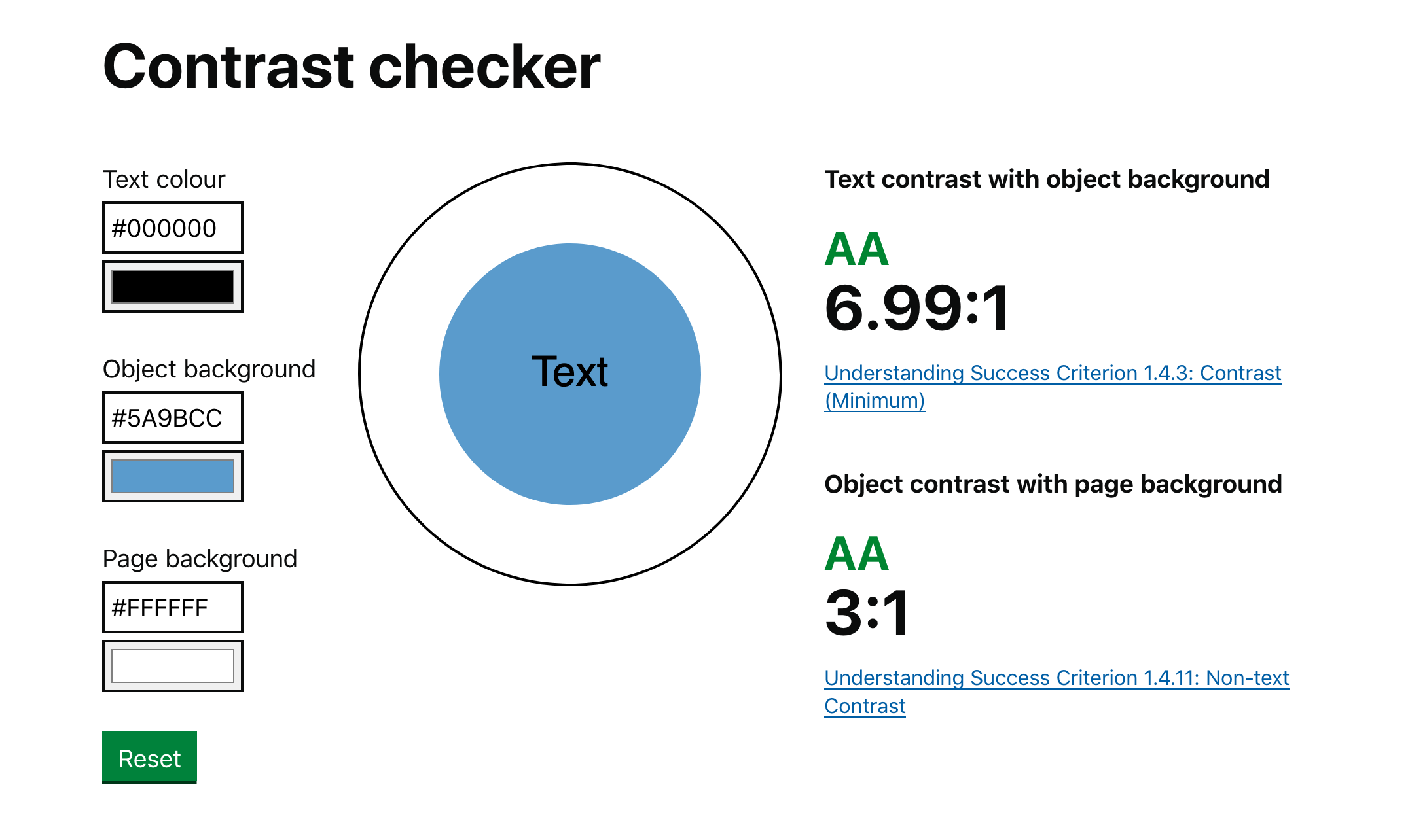
Start by assessing your current design. Use tools like the Web Content Accessibility Guidelines (WCAG) to evaluate contrast ratios. WCAG recommends a minimum contrast ratio of 4.5:1 for normal text and 3:1 for large text.
Tools like WAVE or Color Contrast Analyzer can help you identify areas where contrast is insufficient.
2. Apply Tools, Methods, or Tactics
Once you’ve identified issues, apply the following strategies:
- Use dark text on a light background or light text on a dark background.
- Avoid using pure white or pure black; instead, opt for desaturated shades to reduce glare.
- Test different color combinations using contrast checkers like WebAIM’s Contrast Checker.
- Consider colorblind-friendly palettes to ensure visibility for users with color vision deficiencies.
3. Measure, Analyze, and Optimize
After implementing changes, test them with real users, including those with low vision. Gather feedback and use analytics tools to track engagement metrics such as dwell time, bounce rate, and click-through rates.
Continuously refine your design based on data and user input. Tools like Google Analytics and Hotjar can provide insights into how users interact with your content.
Real or Hypothetical Case Study
Let’s consider a hypothetical case study of a news website that implemented high contrast design:
Before: The site used a light gray text on a white background, which was difficult for many users to read, especially in low-light conditions. Bounce rates were high, and user engagement was low.
After: The website updated its design to use dark blue text on a white background, with a contrast ratio of 4.5:1. They also introduced a dark mode option for users who preferred it.
Results:
– Bounce rate decreased by 20%.
– Average session duration increased by 15%.
– User satisfaction scores improved significantly, with positive feedback on readability and ease of navigation.
This example illustrates how high contrast design can directly impact user behavior and business outcomes.
Tools and Techniques for High Contrast Design
Here are some modern tools and techniques that can help you implement high contrast design effectively:
- Adobe Color – A powerful tool for generating color schemes with optimal contrast.
- WebAIM Contrast Checker – A free online tool that checks contrast ratios and provides recommendations.
- Lighthouse (Chrome DevTools) – Built-in accessibility audits that include contrast analysis.
- Contrast Ratio – A browser extension that highlights low-contrast text on any webpage.
- Dark Mode Toggle – Allows users to switch between light and dark themes, catering to different preferences and environments.
- Accessibility Testing Tools – Such as axe and NVDA, which simulate how users with disabilities interact with your site.
Future Trends and AI Implications
As AI continues to shape the digital landscape, the importance of high contrast design will only grow. Emerging technologies like search generative experience (SGE) and multimodal interfaces will place even greater emphasis on clarity and legibility.
AI-driven tools are already being developed to automatically detect and suggest contrast improvements. For example, Google’s Material You and Apple’s Dynamic Color systems adapt color schemes based on user preferences and environmental factors.
Looking ahead, we can expect AI-powered accessibility assistants that will analyze content in real-time and recommend contrast adjustments. This will make it easier than ever to create inclusive designs that cater to a wide range of users.
Key Takeaways
- High contrast design improves readability for low-vision users and enhances the overall user experience.
- It supports assistive technologies and meets legal standards like the ADA.
- Implementing high contrast design involves auditing your current design, applying best practices, and continuously measuring results.
- Tools like WebAIM and Adobe Color can help you achieve optimal contrast ratios.
- As AI evolves, high contrast design will become even more critical in ensuring accessibility and usability.
By prioritizing high contrast design, you’re not just making your content more accessible—you’re also building a more inclusive and user-friendly digital environment.
Meta Title: High Contrast Design: Enhancing Readability for Low-Vision Users
Meta Description: Learn how high contrast design improves readability for low-vision users and why it’s essential for inclusive web development.
SEO Tags: high contrast design, accessibility, low vision, readability, web design
Internal Link Suggestions:
– Search Intent Alignment
– User Journey Alignment
– Semantic Keyword Mapping
External Source Suggestions:
– Web Content Accessibility Guidelines (WCAG)
– WebAIM Contrast Checker
– National Eye Institute


