In an age where data is abundant, the ability to quickly interpret and act on information is more critical than ever. Whether you’re a business professional, a researcher, or a student, the challenge often lies not in gathering data, but in making sense of it. This is where data tables and charts come into play. These tools are not just visual aids—they are essential instruments for simplifying complex information, enabling faster decision-making, and enhancing overall comprehension.
From financial reports to scientific studies, data visualization has become a cornerstone of modern communication. In this article, we’ll explore how data tables and charts transform raw numbers into meaningful insights, the advantages they offer, and the best practices for using them effectively.
What Is Data Tables and Charts and Why It Matters
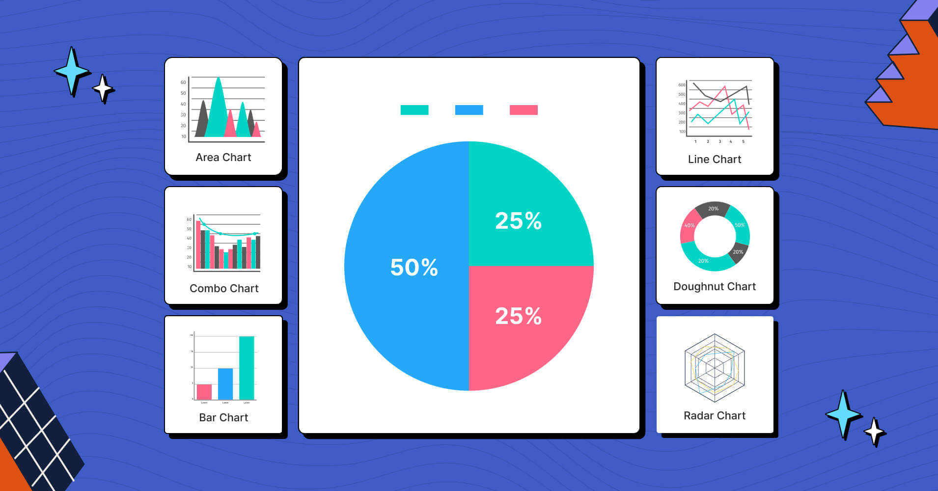
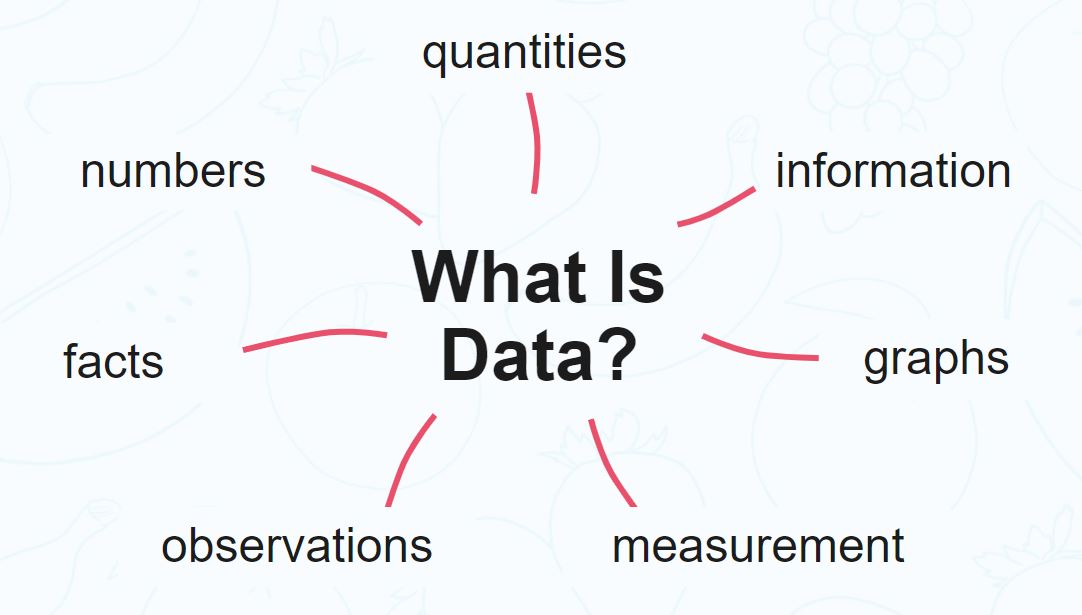
At its core, data tables and charts are visual representations of information designed to make complex datasets easier to understand. A table organizes data into rows and columns, while a chart—such as a bar graph, pie chart, or line graph—uses visual elements like bars, lines, and slices to convey trends, comparisons, and patterns.
These tools are especially important in today’s fast-paced world, where time is a valuable resource. Instead of sifting through thousands of numbers in a spreadsheet, users can quickly grasp key insights from a well-designed chart or table. This is why data visualization has become a vital component of fields ranging from business analytics to public policy.
According to a study by the University of California, San Diego, the human brain processes visual information 60,000 times faster than text. This means that when data is presented visually, it’s not only easier to understand but also more likely to be remembered.
How Data Tables and Charts Impact Information Comprehension
The impact of data tables and charts on information comprehension is profound. Here are a few key ways they enhance understanding:
1. Visual Clarity
A well-structured table or chart can eliminate confusion by organizing data in a logical, easy-to-follow format. For example, a simple bar chart can show sales performance across different regions in seconds, whereas a lengthy table might require minutes to parse.
2. Trend Identification
Charts are particularly effective at highlighting trends over time. A line graph, for instance, can clearly show whether a company’s revenue is increasing, decreasing, or remaining stable. This helps stakeholders make informed decisions based on historical data.
3. Comparison and Contrast
Data tables allow for direct comparison between different categories or variables. A side-by-side comparison of product sales, customer demographics, or project timelines can reveal patterns that would be difficult to spot in a textual format.
4. Simplification of Complex Data
Large datasets can be overwhelming. Charts and tables help break down complex information into digestible pieces. For example, a pie chart can illustrate the percentage distribution of a budget, while a scatter plot can show the relationship between two variables.
5. Improved Communication
Whether presenting to a team, a client, or a board of directors, data visualization ensures that your message is clear and impactful. Visuals can engage audiences more effectively than text alone, leading to better retention and action.
Step-by-Step Implementation Framework
Implementing data tables and charts effectively requires a structured approach. Here’s a step-by-step guide to help you get started:
1. Define Your Objective
Before creating any visual, ask yourself: What is the purpose of this data? Are you trying to show a trend, compare values, or highlight a specific insight? Clarifying your objective will help you choose the right type of chart or table.
2. Choose the Right Format
Different types of data require different visual formats:
– Bar charts for comparing quantities.
– Line graphs for showing trends over time.
– Pie charts for displaying proportions.
– Tables for precise numerical data.
Consider your audience and the context in which the data will be used. For example, a dashboard for executives may benefit from interactive charts, while a report for clients might need static visuals.
3. Design with Simplicity in Mind
Avoid clutter. Use consistent colors, fonts, and labels. Ensure that the most important information is highlighted. Remember, clarity is key. Overcomplicating a chart can lead to confusion rather than understanding.
4. Use Tools to Create and Customize
Leverage software like Excel, Google Sheets, Tableau, or even AI-powered tools like BioBrain to generate and customize your visualizations. These platforms offer templates, drag-and-drop interfaces, and advanced features to help you create professional-looking charts and tables.
5. Test and Refine
Once your visualization is ready, test it with a small group of users to see if they can easily interpret the data. Gather feedback and make adjustments as needed. This step is crucial to ensuring that your data is both accurate and accessible.
Real or Hypothetical Case Study
Let’s consider a hypothetical scenario involving a retail company that wants to improve its inventory management. The company has been struggling with overstocking certain products and understocking others, leading to lost sales and excess storage costs.
By implementing a data table and chart system, the company can track inventory levels, sales trends, and seasonal demand. For example, a line graph could show the monthly sales of each product, while a stacked bar chart could display the total inventory across different departments.
After analyzing these visuals, the company identifies that a particular product line is consistently underperforming. They adjust their purchasing strategy, reduce stock for that line, and reallocate resources to higher-demand items. As a result, their inventory turnover improves by 20%, and their profit margin increases by 15%.
This case study illustrates how data tables and charts can drive actionable insights and improve business outcomes.
Tools and Techniques for Data Tables and Charts
Several tools and techniques can help you create effective data visualizations:
- Excel / Google Sheets: Ideal for basic charts and tables, with built-in templates and customization options.
- Tableau: A powerful tool for creating interactive dashboards and advanced visualizations.
- Power BI: Microsoft’s business analytics tool that allows for real-time data exploration.
- BioBrain: An AI-based platform that generates extended client-facing summaries, helping to translate complex data into narrative form.
- Canva: A user-friendly design tool that offers templates for charts, infographics, and presentations.
- D3.js: A JavaScript library for creating dynamic, interactive data visualizations.
Each of these tools has its strengths, and the choice depends on your specific needs, technical expertise, and the complexity of the data you’re working with.
Future Trends and AI Implications
As technology continues to evolve, the role of data tables and charts is set to expand further. With the rise of AI-driven analytics, we can expect more automated and intelligent visualizations that adapt to user behavior and provide real-time insights.
For example, AI can analyze large datasets and automatically generate the most appropriate chart or table based on the data’s structure and the user’s goals. This not only saves time but also reduces the risk of misinterpretation.
Moreover, multimodal search and voice-activated assistants are changing how people interact with data. Soon, users may be able to ask questions like, “What were our sales last quarter?” and receive a visual summary without ever opening a spreadsheet.
To stay ahead, professionals should familiarize themselves with AI-powered tools and continue refining their data visualization skills. The future belongs to those who can turn data into stories that resonate with their audience.
Key Takeaways
- Data tables and charts simplify complex information, making it easier to understand and act upon.
- They enhance communication by transforming raw data into visual narratives that engage and inform.
- Effective implementation involves defining your objective, choosing the right format, and designing with simplicity in mind.
- Tools like Excel, Tableau, and AI platforms such as BioBrain can streamline the process and improve accuracy.
- The future of data visualization is driven by AI, automation, and multimodal interaction, offering new opportunities for insight and engagement.
In a world where data is everywhere, the ability to visualize and communicate it effectively is no longer a luxury—it’s a necessity. By mastering the use of data tables and charts, you can unlock deeper insights, make better decisions, and drive meaningful outcomes.
Ready to take your data storytelling to the next level? Explore tools like BioBrain and discover how the fusion of human expertise and artificial intelligence can transform the way you present and interpret data.
Reach out to us at connect@biobrain.io to learn more.
Meta Title: How Data Tables and Charts Simplify Information Comprehension
Meta Description: Discover how data tables and charts transform complex data into clear, actionable insights. Learn best practices for effective data visualization.
SEO Tags (5): data visualization, data tables, charts, information comprehension, data analysis
Internal Link Suggestions: Parameter #1: Search Intent Alignment, Parameter #7: Semantic Keyword Mapping, Parameter #12: PAA Question Targeting
External Source Suggestions: https://www.data.gov, https://www.tableau.com, https://www.excel-easy.com